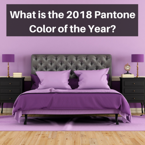
 Pantone has always had its eye on color and being the color experts that they are, they have chosen yet another “Color of the Year” winner in “Ultra Violet,“ a purple hue that Pantone believes represents and resonates not only daring originality and visionary thought but an uplifting of spirit.
Color is the Pantone Institute’s forte and their color of the year choice, and other selections prior to that, have generated impact and influence on color alternatives and interior decorating trends on a yearly basis and beyond.
Pantone’s Selection Influence
Pantone’s 2017 choice of “Greenery” inspired the ascent of new color levels through the association with nature and the burgeoning growth and green abundance of the outdoors. Greenery’s influence was expanded through other natural choices in yellows and other light and vibrant colors that were later seen in both homes and fashion houses. It only stands to reason that Ultra Violet would likely have the same effect and influence as other Pantone selections have. Like Greenery, Ultra Violet has the ability to influence and transform through its boldness, elegance and enriching qualities.
Perfect or not so Perfect Color
Color critics are exclaiming that purple can be a troublesome color, as there are those who obsess over it while others would like to avoid it. So, as divisive as it can be, utilizing it in a home decorating scheme may not make it the number one color of choice with more traditional consumers, but Pantone feels differently and believes their 2018 current favorite could be a transformative one.
According to Pantone color experts, the use of Ultra Violet can recharge a room in a number of different ways, and since purple hues relate varying meanings and degrees of expression, their use can be integrated into almost any design scheme.
Purple Variances
Lighter purple hues can relate romance, delicacy and nostalgia, while darker hues have a tendency to bring out less positive aspects, yet bright purple can enrich, as it suggests royalty and elegance. Depending on a room’s size, its design scheme and the mood to be conveyed, the use of most any purple hue can stimulate interest in a space as well as add a touch of class or polish to an area.
A deeper purple wall can easily be toned down through one simple accent wall as well as accessories and textural aspects provided through paintings, photographs, architectural wall pieces, flooring and other items that balance out the color. Plus the color itself can call attention to the nuances and subtleties of any standing furnishings in a room.
Ultra Violet is meant to make a statement. It can suggest a tradition, or bring boldness or sheer elegance to a space. With so many uses and nuances that purple hues offer, a modern living area, inn, hotel suite or commercial space can become centers of attraction that create warmth, strength and welcoming to homeowners, travelers and business owners.
Pantone’s Stream of Colors
Pantone will continue to excite with new colors across the spectrum and will announce yearly color winners on schedule as well as add additional colors in playful and cheerful palettes designed to please the child in everyone.
Their colors create excitement, and the Institute’s release of a color centered book, The Complete Color Harmony (Pantone edition) is one that reaffirms Pantone’s commitment to provide the revolutionary colors that so many lovers of color want to experience in their homes, businesses and travel retreats.
If Pantone’s color of the year is of interest to you, or other color selections come to mind, complete the online contact form and a color expert will get back to you with the information you need to discover what will work in your space and coordinate with your home design and decor. Who knows, Ultra Violet just might be part of your color destiny.